info@maff.be
+32 (0)478 96 05 60
knack weekend black
Project info
MAFF did a restyling of knack weekend B L A C K. We went for a flexible 12 columns grid, mean typography, bold colours, quirky photography and lots of B L A C K turning it back into a collector's item
Typography
GT super
Typography
lab grotesk
12 - columns grid
the use of a 12 columns grid creates endless possibilities and a flexible workspace to play around
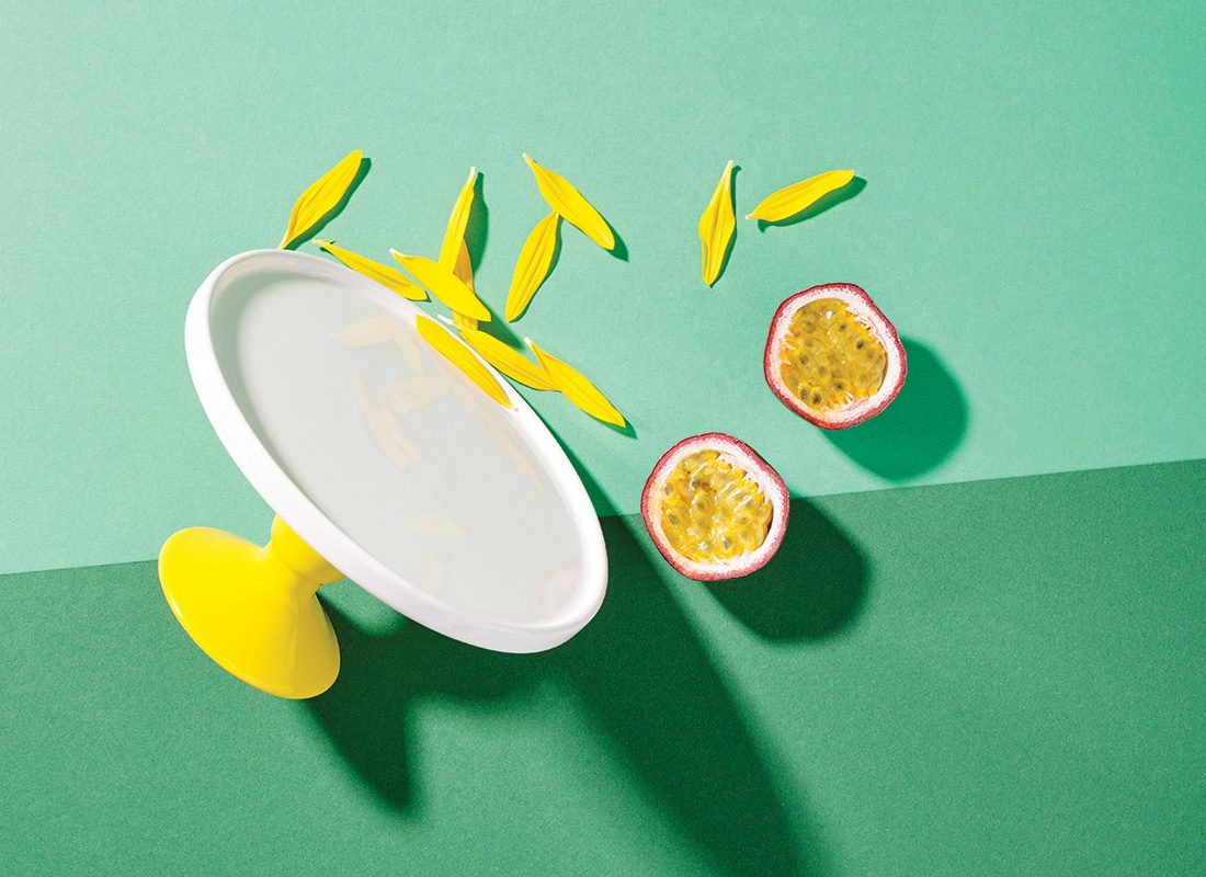
quirky fotography
more black!
BLACK before & after
application of the grid
making space for big title pages
application of the grid
asymmetrical columns
application of the grid
combining all the text on one page, creates more space for the pictures and makes it more relaxed to read
application of the grid
coloured pages and bold typography
application of the grid
different use of columns creates more white space
first new BLACK
client: knack weekend
concept: elke treunen
Inspiring work
Show all work