info@maff.be
+32 (0)478 96 05 60
PZR
Project info
At Politie Zone Rupel, they strive to be an open, professional, and flexible organization that is constantly innovating and adapting to social developments. The rebranding reflects this commitment by not only designing a new logo but a flexible design system. A design system that is easily recognizable. We believe that recognizability is key to building trust and connecting with the community.
identity guide
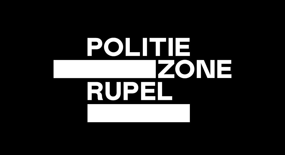
logo
the logo starts from the 5 municipalities of PZR, (Boom, Hemiksem, Niel, Schelle, Rumst) which are converted into blocks that form the base of the logo and the rest of the graphic identity. The blocks symbolise building blocks that can create an endless combination of shapes. Moreover they are a subtle reference to the brick factories of the rupel zone.
baseline
The values & ambitions of Politie Zone Rupel are embodied in the baseline:
HIER. NU. MORGEN. (HERE. NOW. TOMORROW.)
PZR is always nearby to ensure security in the police zone in a professional manner.
Not only today, but also in the future.
design system
The 5 blocks which form the logo of Politie Zone Rupel also provide the foundation for the entire design system. Based on these blocks, a grid was created from which all layouts can be built in a consistent manner.
brochure diefstal
attest aanvraag
korps bijbel
jobs flyer
client : Politie Zone Rupel
art direction : elke treunen
design : elke treunen - frank schouwaerts
copy : johan de witte
Inspiring work
Show all work